
Powerful Content Management System for Websites
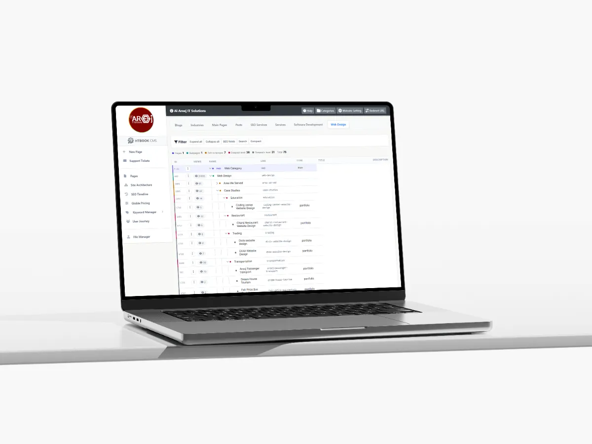
Manage website pages, content, SEO, URLs, files, and site structure from one powerful Content Management System built by Al Areej IT.
Read the articleLearn why designing for smaller screens is important for modern websites.
People use websites on phones, tablets, laptops, and desktop computers every day. A website that works well on a large screen but becomes difficult to use on a phone is no longer doing its job properly.
Mobile-first web design starts with the smaller screen and builds the experience from there. Instead of designing a large desktop page and trying to squeeze it onto a phone later, you first decide what is most important for mobile users and then expand the experience for larger screens.
This approach helps create websites that are easier to use, faster, and more focused across different devices.
Mobile-first does not mean creating a separate mobile website. It means thinking about the mobile experience from the beginning of the design process.
A smaller screen forces you to decide what information matters most. You have less space for large menus, unnecessary decorations, long navigation bars, and complicated layouts. That limitation can actually lead to a cleaner and more useful website.
Once the important mobile experience is working well, the layout can be expanded for tablets, laptops, and larger desktop screens.
A visitor should not have to pinch, zoom, rotate the screen, or scroll sideways just to understand your website. Text should be readable, buttons should be easy to tap, and important information should remain accessible.
Mobile users are also often looking for something quickly. They may want your phone number, location, opening hours, a service, a product, or a way to contact you. A good mobile design makes those actions simple.
The layout should adapt naturally to different screen sizes instead of forcing users to view a desktop page on a small screen.
Mobile menus should make important pages easy to find without taking up unnecessary space or creating confusing navigation.
Text, headings, links, and other content should remain comfortable to read without zooming or struggling with small typography.
Buttons, links, menus, forms, and other controls should have enough space to use comfortably with a finger.
Mobile users may have slower connections or limited resources, so images, scripts, and other page elements should be optimized.
Give mobile visitors the information they need without overwhelming them with unnecessary sections, effects, or distractions.
When designing mobile first, begin by deciding what the visitor absolutely needs to see and do. This helps remove unnecessary elements before they become part of the layout.
For example, a business website may need its main service, phone number, enquiry button, key information, and navigation immediately available. Less important information can appear further down the page.
Once the mobile structure works, additional space on larger screens can be used to improve the presentation without changing the basic purpose of the page.
Desktop websites often have enough space for large navigation menus with several categories and dropdowns. On mobile, that same navigation can quickly become difficult to use.
A mobile menu should focus on the pages visitors are most likely to need. If the website has a large number of pages, organize them carefully rather than placing everything into one overwhelming menu.
The visitor should always know how to open the menu, where they are, and how to return to important sections.
Links and buttons designed for a mouse can be frustrating on a touchscreen when they are too small or placed too close together.
Important actions should have enough space around them so users can tap them confidently. This is particularly important for contact buttons, add-to-cart actions, booking controls, menus, and form elements.
Good mobile design considers how someone actually holds and uses a phone rather than treating the screen as a small desktop monitor.
Mobile screens have less available space, so typography becomes especially important. Text that looks comfortable on a large monitor may become difficult to read when displayed on a phone.
Use clear headings, comfortable line spacing, readable paragraph sizes, and enough space between sections. Long paragraphs can also be broken into smaller sections so visitors can scan the page more easily.
Images can make a website much more attractive, but large unoptimized images can also make it slow.
Images should be compressed and displayed at an appropriate size. The website should also make sure important images remain useful on smaller screens rather than becoming cropped in a way that removes important information.
Where appropriate, responsive image techniques can allow different image sizes to be delivered depending on the visitor's device.
Sometimes desktop designs contain large visual sections that disappear completely on mobile. This can create problems if those sections contain important information.
Mobile design should simplify the experience without removing information that customers actually need. If something is important to the business or the visitor, find a better way to present it on a smaller screen.
Forms are often one of the most important parts of a business website. If a visitor wants to request a quote or contact your company from their phone, the form should not become a frustrating experience.
Use appropriate input fields, clear labels, sensible spacing, and straightforward error messages. Avoid asking for information that is not necessary for the first interaction.
For longer forms, consider whether the information can be divided into simple steps instead of presenting everything on one long mobile page.
Mobile visitors may use cellular connections, older devices, or networks that are slower than a typical office or home broadband connection. Performance therefore becomes even more important.
A fast website generally needs optimized images, efficient code, sensible use of JavaScript, suitable caching, and a hosting environment that can handle the website's traffic.
Performance should be considered during development rather than waiting until the website is finished.
Mobile usability is also closely connected with SEO because search engines need to understand and access your website effectively across devices.
A responsive website, clear content structure, readable text, good performance, and accessible navigation all contribute to a better overall experience.
SEO should therefore be considered alongside mobile design rather than treated as a separate task after the website has been built.
A website can look perfect in a desktop browser and still have problems on an actual phone.
Before launch, test important pages on different screen sizes and devices. Open the menus, complete the forms, tap the buttons, scroll through long pages, view images, and try the main actions exactly as a customer would.
Real-device testing can reveal problems that are easy to miss when only looking at a desktop development environment.
Some mobile problems appear repeatedly across websites. Tiny text, buttons that are difficult to tap, oversized images, slow loading pages, complicated menus, horizontal scrolling, intrusive popups, and forms that are difficult to complete can all make visitors leave.
Another common mistake is simply shrinking the desktop design instead of redesigning the layout for the smaller screen.
Mobile-first design is not about making everything smaller. It is about making the experience work better with less space.
Although the process starts with mobile, the final website still needs to work well on larger screens.
Once the mobile structure is clear, the design can use additional desktop space for larger images, wider layouts, multiple columns, richer navigation, and other elements that make sense on larger screens.
The goal is one consistent website that adapts to the device being used.
Good responsive design should feel natural rather than noticeable. Visitors should not have to think about whether they are using a phone, tablet, or desktop computer. They should simply be able to use the website.
That means the layout, content, navigation, forms, images, buttons, and performance all need to work together across different screen sizes.
Designing for mobile first can help you create a cleaner website for everyone. By deciding what matters most, simplifying navigation, improving readability, and removing unnecessary elements, you often end up with a better desktop experience as well.
Once the mobile experience is considered, the next important part is making sure the website has the right information and content to support its pages.
Next guide: Website Content Planning — how to organize the text, images, services, and information your website needs.
Helpful tips, insights and updates on websites, software and digital growth.

Discover the 5 things customers look for within seconds of opening your website, from clear messaging and professional design to trust, navigation, and strong calls to action.
Read the article
Manage website pages, content, SEO, URLs, files, and site structure from one powerful Content Management System built by Al Areej IT.
Read the article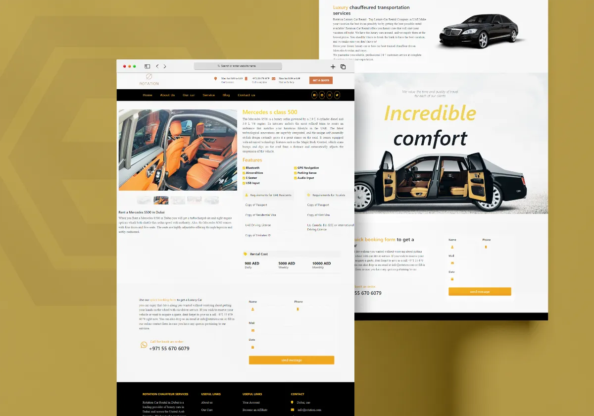
Discover how Al Areej IT designed a professional website for Rotation Car Rental with responsive design, SEO-friendly structure, and stronger Google visibility.
Read the article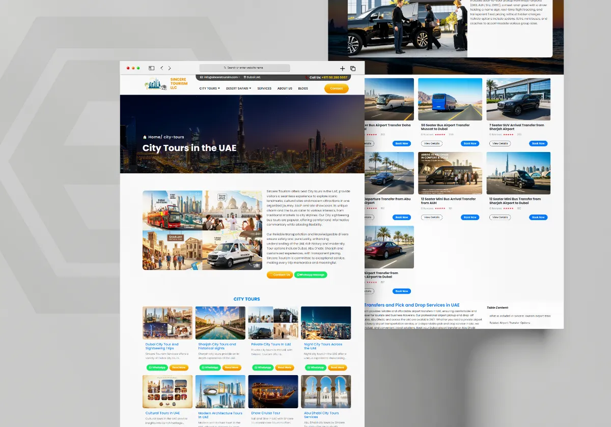
See how Al Areej IT developed a professional website for Sincere Tourism with user-friendly design, SEO-ready content, and stronger Google visibility.
Read the article


