
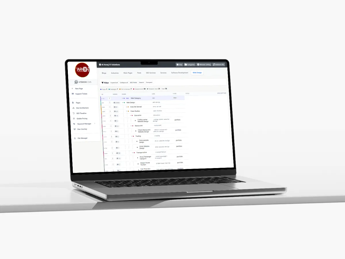
Powerful Content Management System for Websites
Manage website pages, content, SEO, URLs, files, and site structure from one powerful Content Management System built by Al Areej IT.
Read the articleLearn the key design principles behind a practical and customer-friendly online store.
An ecommerce website has one important job: help people find the right products, understand them, trust the store, and complete their purchase without unnecessary difficulty.
A good online store is therefore more than a collection of product images and a shopping cart. The design needs to make browsing comfortable, product information easy to understand, and the buying process simple from the first visit to checkout.
Whether you are starting a small online shop or building a larger ecommerce platform, the same principle applies: design the store around how your customers actually shop.
Before designing the store, think about who will be shopping on it. What are they looking for? Do they already know which product they want, or do they need help choosing? Will most visitors come from mobile phones? Are they comparing several products before buying?
Understanding these things helps determine how categories, search, filters, product pages, recommendations, and checkout should work.
An online store should feel simple from the customer's point of view, even when there is a lot of technology working behind it.
When a store has only a few products, navigation can be simple. As the product catalogue grows, structure becomes much more important.
Products should be grouped into categories that make sense to customers. If necessary, categories can have subcategories, collections, brands, or other useful groupings.
The visitor should not need to understand how your company organizes its inventory. The website should organize products in a way that makes sense from the customer's perspective.
Group products into clear categories so customers can quickly find the type of product they are looking for.
Give customers a fast way to find specific products, especially when your store has a large catalogue.
Help shoppers narrow products by useful options such as price, size, brand, color, category, or other attributes.
Use collections or curated groups to help customers discover related products and useful buying options.
The product page is where a customer decides whether the product is worth buying. It needs to provide enough information for that decision without making the page difficult to understand.
Good product pages normally give customers a clear product name, useful images, pricing, availability, important specifications, variations, and an obvious way to purchase.
The exact information depends on what you sell. Clothing may need sizes and colors, electronics may need specifications, while furniture may need dimensions, materials, delivery information, and care instructions.
Online shoppers cannot physically touch or examine the product, so images become an important part of the buying experience.
Use clear, high-quality images that show the product from useful angles. Where appropriate, include close-up images, different views, lifestyle images, or images showing size and scale.
Images should still be optimized so they do not unnecessarily slow down the website.
Customers should not have to search through a long paragraph to find basic information. Use clear headings, short sections, specifications, and other suitable formatting to make important details easy to scan.
Pricing should be clear and consistent. If there are discounts, promotions, taxes, delivery charges, or other costs that affect the final price, explain them clearly rather than surprising customers later in the checkout process.
Once a customer has decided to buy, the next step should be obvious. The add-to-cart or purchase action should be easy to find and easy to use on both desktop and mobile.
If a product has options such as size, color, quantity, or configuration, those choices should be simple to understand before the customer adds the product to the cart.
The shopping cart gives customers a chance to review what they are buying before moving to checkout.
It should clearly show the selected products, quantities, prices, discounts where applicable, and estimated additional costs. Customers should also be able to update quantities or remove products without starting the process again.
The purpose of the cart is not to distract the customer. It is to give them confidence that everything is correct before they continue.
Checkout is one of the most important parts of an ecommerce website. A customer can be ready to buy and still leave if the process is confusing, slow, or asks for unnecessary information.
Keep the checkout focused. Ask only for information that is actually required to complete the order, explain shipping and payment clearly, and make errors easy to understand and correct.
Collect the information needed to process and deliver the order without making the form unnecessarily complicated.
Make delivery areas, shipping options, expected times, and related charges easy to understand.
Provide suitable payment options and clearly explain what happens when the customer completes payment.
Clearly confirm that the order has been received and provide the customer with the information they need next.
Many customers will browse and shop from their phones, so mobile ecommerce design deserves special attention.
Product images should fit the screen properly, important information should remain easy to read, buttons should be comfortable to tap, and forms should not become frustrating to complete.
The customer should be able to move from product discovery to checkout without constantly zooming, scrolling sideways, or dealing with controls that are difficult to use.
Customers are giving your business money and, in many cases, personal information. They need to feel comfortable before completing the purchase.
Your ecommerce website should clearly communicate who you are, how customers can contact you, how delivery works, what happens if they need to return something, and how their information and payment are handled.
Give customers confidence that their personal information and payment process are handled appropriately.
Make returns, refunds, delivery terms, and other important policies easy to find and understand.
Genuine reviews and customer feedback can help shoppers feel more confident about their purchase.
Give customers a clear way to ask questions or get help before and after placing an order.
Product recommendations can help customers discover related products, alternatives, accessories, or items they may have missed.
For example, someone buying a camera may also need a memory card, while someone buying a laptop may be interested in a suitable bag or accessory.
Recommendations should be useful rather than overwhelming. Too many unrelated products can make the shopping experience feel cluttered.
Search becomes especially important when a store has hundreds or thousands of products. Someone who already knows what they want should be able to find it quickly.
Search should handle common product names and, where appropriate, variations in wording. Helpful filters and sorting options can then make it easier to narrow the results.
Categories should reflect how customers think about your products. If someone cannot understand where a product belongs, they may struggle to find it.
Try to avoid creating too many categories simply because the product database allows it. A smaller number of meaningful categories is often easier to navigate than a complicated structure with dozens of nearly identical options.
SEO can help people discover your products and categories through search engines. This starts with a logical store structure and useful pages.
Product names, category descriptions, page titles, headings, URLs, internal links, images, and useful product information can all contribute to how search engines understand the store.
Do not create hundreds of thin pages simply because you can. Each important page should provide useful information and serve a clear purpose.
Ecommerce websites can become heavy because they often contain many product images, scripts, tracking tools, filters, payment integrations, and other functionality.
Performance should therefore be considered from the beginning. Optimize images, reduce unnecessary code, use suitable caching and hosting, and avoid adding features that provide little value to the customer.
Not everyone enters an online store in the same way. One customer may arrive through Google on a specific product page, another may enter through an advertisement, and someone else may start from the homepage.
Every important landing page should therefore provide enough context for a new visitor to understand where they are and what they can do next.
Internal links, related products, categories, search, and clear navigation can help customers move naturally through the store.
When customers are choosing between similar products, useful comparison information can make the decision easier.
Depending on what you sell, this could include specifications, sizes, features, materials, compatibility, pricing, or other important differences.
The goal is to help the customer make a confident decision rather than forcing them to open several pages and remember the details themselves.
The ecommerce experience does not end when someone clicks the payment button.
Customers need confirmation, order information, delivery updates, support, and a clear way to contact the business if something goes wrong.
A well-designed post-purchase experience can build trust and encourage customers to return.
There can be a lot happening behind an ecommerce website, but customers should not have to think about all of it.
They should be able to find a product, understand it, decide whether they want it, add it to the cart, pay, and know what happens next.
That simplicity is the result of thoughtful planning, clear design, good content, reliable technology, and careful attention to the customer journey.
Before starting the visual design, it is worth deciding what products you will sell, how they will be organized, what information customers need, which payment and delivery methods are required, and how orders will be managed.
The answers will influence the website structure and the technology behind the store. Planning these things early can prevent major changes later.
An online store needs to work particularly well on smaller screens because customers often browse and purchase from mobile devices. Product pages, menus, filters, carts, forms, and checkout all need to adapt to different screen sizes.
Next guide: Mobile First Web Design — why designing for smaller screens first can create a better experience across devices.
Helpful tips, insights and updates on websites, software and digital growth.

Discover the 5 things customers look for within seconds of opening your website, from clear messaging and professional design to trust, navigation, and strong calls to action.
Read the article
Manage website pages, content, SEO, URLs, files, and site structure from one powerful Content Management System built by Al Areej IT.
Read the article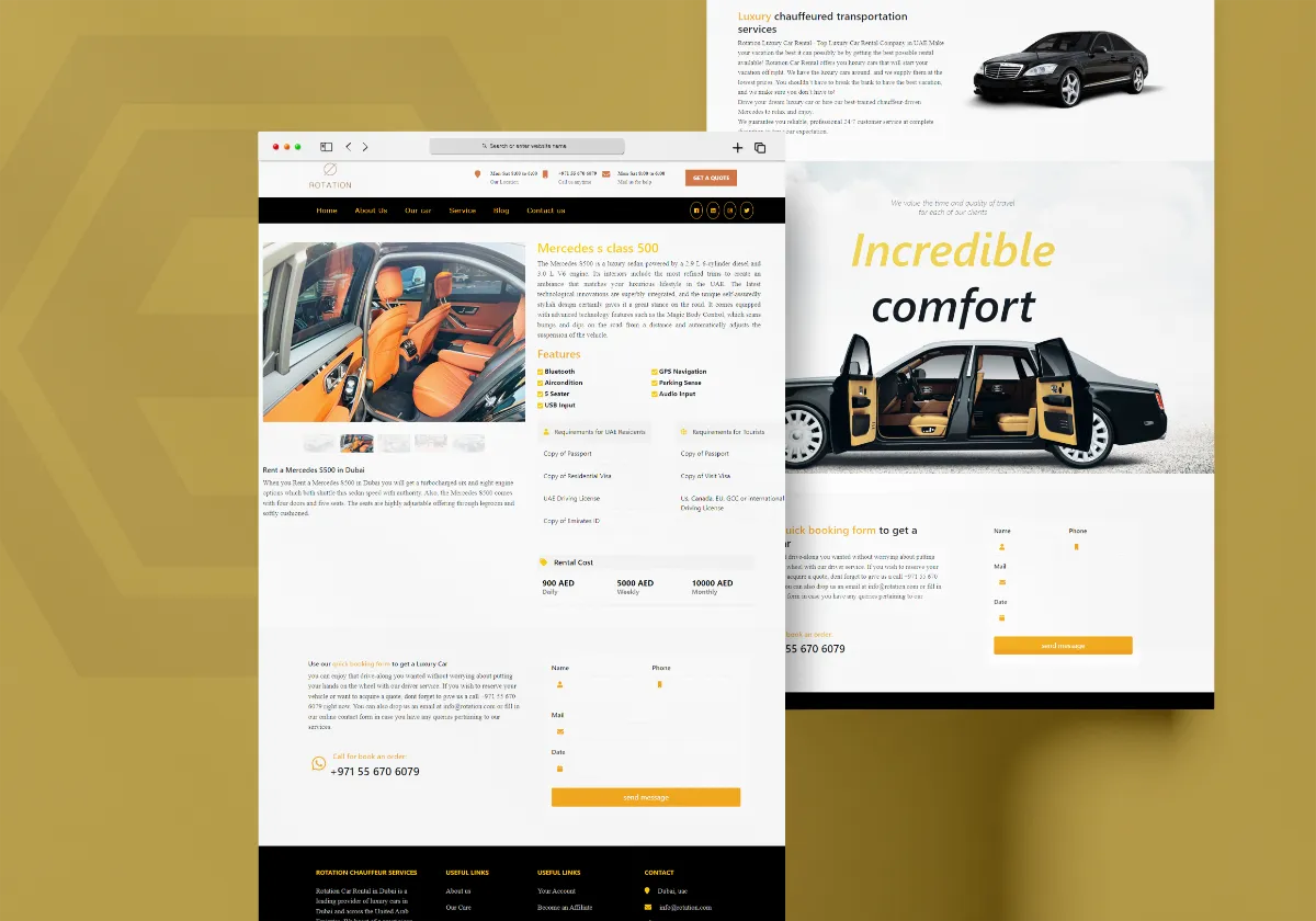
Discover how Al Areej IT designed a professional website for Rotation Car Rental with responsive design, SEO-friendly structure, and stronger Google visibility.
Read the article
See how Al Areej IT developed a professional website for Sincere Tourism with user-friendly design, SEO-ready content, and stronger Google visibility.
Read the article


